


Overview
Streamline your data visualization in Google Sheets with our comprehensive guide on creating a demographic chart. Efficiently organize and present demographic information, enhancing clarity and understanding. Follow the step-by-step instructions to seamlessly craft demographic charts, optimizing your data representation for improved insights within the Google Sheets platform. Elevate your data management strategies with this user-friendly guide, ensuring a smooth and effective process for creating insightful demographic charts.
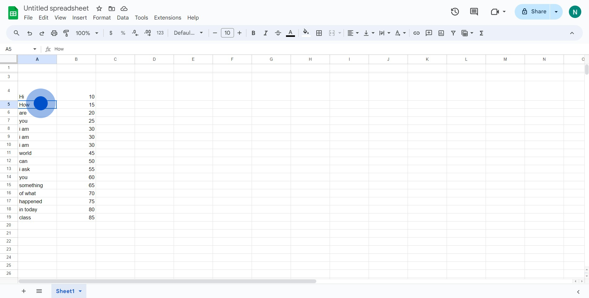
1. Start by identifying the elements for your chart.
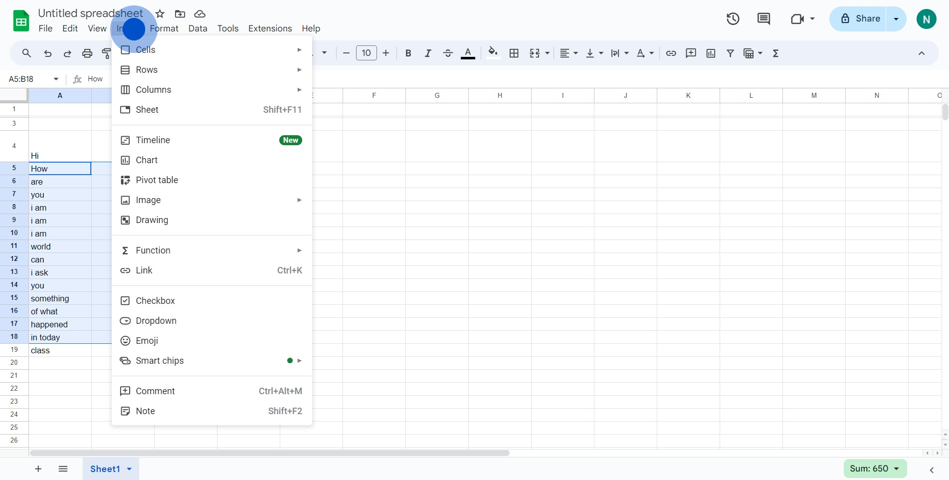
2. Next, click on the 'Insert' option in the toolbar.
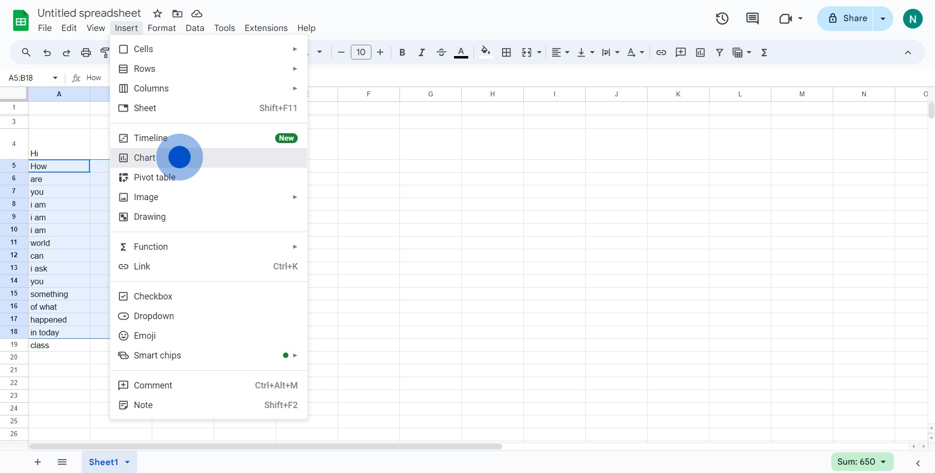
3. Then, select the 'Chart' option from the dropdown.
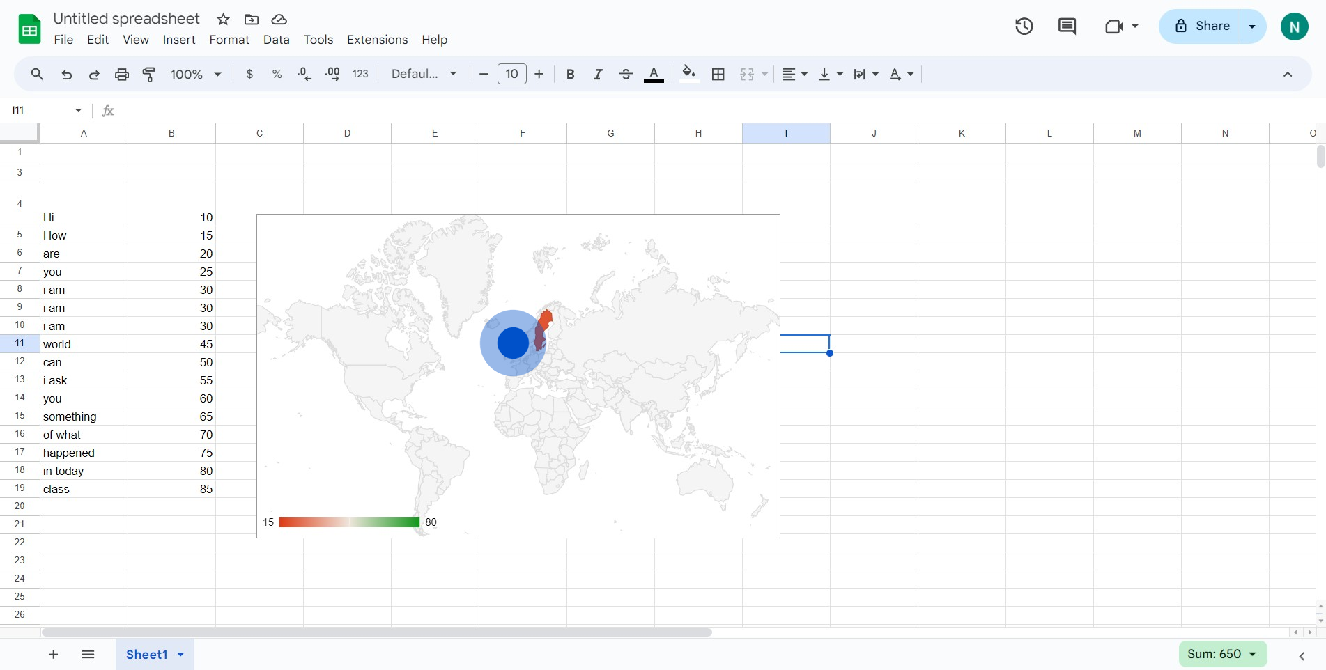
4. Now, opt for 'Column chart' to choose the chart type.
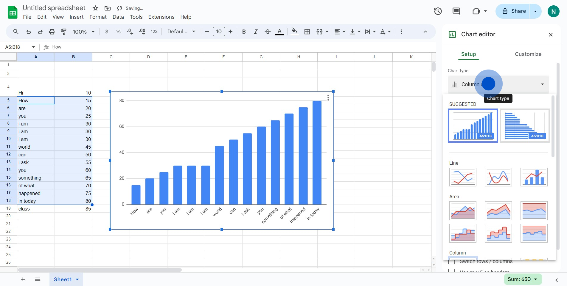
5. To finalize, verify if your demographic chart has been added.
Create your own step-by-step demo
Scale up your training and product adoption with beautiful AI-powered interactive demos and guides. Create your first Supademo in seconds for free.
